Introduction
Although data appears strong, it can be challenging to understand rows upon rows of figures. Charts are useful in this situation. They transform uncomplicated data into easily comprehensible information.
Many individuals desire to use Excel to create charts, but when they launch the application, they become stuck. The data and buttons are present, but the chart still doesn’t appear correct. This typically occurs when the chart type is incorrect, the data is improperly chosen, or the layout is excessively cluttered.
The good news is that creating a decent chart doesn’t need extensive abilities. Once you understand the proper processes, Excel simplifies the process.
This tutorial teaches how to create charts in Excel in an easy-to-follow manner, which chart kinds are most effective, how to steer clear of frequent errors, and how to make your charts appear neat and polished.
A Brief Response
Quick Answer: Choose your data, select the Insert tab, select a chart type, and then modify the layout and labels to create charts in Excel. Instead of selecting the first choice they see, most individuals receive better outcomes when they select the graphic that corresponds with the data.
Why Are Excel Charts Important?
Why It Occurs
Pictures are easier for people to grasp than statistics. It might be intimidating to see a table full of data, particularly when you need to identify patterns or compare outcomes.
That issue is resolved by charts. They make change, size, and comparison easy to read at a glance.
The Solution
When you wish to, use charts:
- Compare the values
- Demonstrate development across time
- Show portions of a whole
- Emphasize current trends
- Make reports simpler to read
A chart should always make the information easier for the reader to comprehend. It is only ornamental if it doesn’t do that.
The outcome
It becomes simpler to share, explain, and retain your data.
How Do You Make Excel Charts Step-by-Step?
Why It Occurs
Because Excel offers so many possibilities, many novices believe that creating charts is difficult. For the first time, that may seem overwhelming.
However, if you understand the order, the fundamental procedure is straightforward.
The Solution
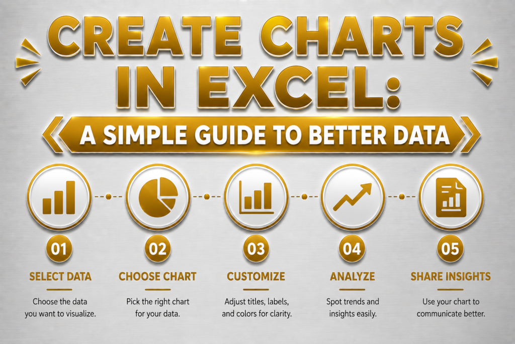
To create charts in Excel, follow these steps:
- Put your data into columns or rows.
- Give categories and values explicit labeling.
- Emphasize the entire spectrum of data
Select the Insert tab.
- Select the type of graphic that best suits your data.
- If necessary, provide a legend, axis labels, and a title.
- Make the chart fit nicely on your sheet by resizing it.
Check the chosen range first if the chart is incorrect. The majority of issues are caused by incorrect cell selection or missing labels.
Typical Errors
- Choosing just the values rather than the labels
- Selecting a graphic prior to comprehending the data outcome
You receive a precise, understandable chart that is prepared for use in a report or presentation.
Which Excel Chart Type Is Best?
Why It Occurs
Not all charts are suitable for all types of data. A poor decision may make the chart more difficult to interpret rather than easier.
The Solution
Based on your objective, select the type of chart.
| Chart Type | Best Use |
|---|
| Column Chart | Comparing values |
| Bar Chart | Comparing categories with longer labels |
| Line Chart | Showing trends over time |
| Pie Chart | Showing parts of a whole |
| Scatter Chart | Showing relationships between numbers |
Expert Advice
Choose the most straightforward chart that effectively conveys the narrative. Your facts won’t always be easier to grasp with a flashy graphic.
The outcome
Rather of confounding the reader, the chart conveys the meaning in your data.
How Can Excel Charts Be Made Easier to Read?
Why It Occurs
Even if a chart is technically accurate, it may nevertheless be difficult to understand. That typically occurs when the wording is too tiny, the colors are distracting, or the design is crowded.
The Solution
Do the following to make your chart easier to read:
- Include a succinct, understandable title
- Make use of legible font sizes
- Keep your color scheme basic.
- Eliminate excess clutter
- When necessary, label the axes.
- Don’t include too many data series in a single graphic.
Typical Errors
- Excessive use of color
- Making the text too tiny
- Including too much information in a single graphic
The outcome
Your chart seems neater, more polished, and simpler to read at a glance.
How a Chart Is Updated When Does the Data Change?
Why It Occurs
Excel charts are linked to the underlying data. The display should update in tandem with changes in the data. Sometimes it doesn’t behave as you would anticipate since the chart doesn’t incorporate fresh rows or the source range is too limited.
The Solution
If the chart is not updated accurately:
- Verify the range of the source data.
- Ensure that any new columns or rows are added.
- If necessary, right-click the chart and choose Select Data.
- Verify the accuracy of the mapping between labels and values.
- Test the chart once again after saving the file.
Using an Excel table can simplify and improve the dependability of chart updates if data is updated often.
The outcome
When new data is uploaded, your chart remains up to date and saves time.
How Can Excel Charts Be Made to Look Professional?
Why It Occurs
Many Excel charts appear incomplete because users continue to utilize the default settings. The chart could be functional, but it lacks refinement.
The Solution
To give your chart a more polished appearance:
- Keep the layout straightforward.
- Make use of consistent hues
- Comply with the document’s chart style.
- Make sure the chart is properly aligned on the page.
- Keep titles succinct and straightforward.
- Eliminate everything that is not beneficial to the reader.
Keep the chart tidy and official if it’s for a business report. If it’s for a personal or academic assignment, make sure it’s clear and well-organized.
Caution
Just because Excel has effects doesn’t mean you should apply them. Extra style frequently makes the chart appear worse rather than better.
The outcome
Your chart seems prepared for client work, dashboards, reports, and presentations.
Common Questions
1.Why should I use Excel to make charts?
Charts facilitate the comprehension of facts. They assist you in identifying patterns, comparing quantities, and providing visual explanations for numbers. Your audience may notice the message immediately rather of having to read a table.
2.Which Excel chart is the simplest to make?
For novices, a column chart is typically the simplest type of chart. It doesn’t require complex setup and performs well for straightforward comparisons.
3.How can I choose the right kind of chart?
For trends, use a line chart; for comparisons, use a column chart; for sections of a whole, use a pie chart; and for correlations between data, use a scatter chart. Select the graphic that best reflects your data’s narrative.
4.Why is there missing data in my Excel chart?
This typically occurs when the source range does not contain all of the values or when the incorrect cells were chosen. Verify the data range and make any required updates.
5.How can I improve the readability of my Excel chart?
Make use of the appropriate chart type, understandable fonts, straightforward colors, and a succinct title. To make the core message clear to view, remove any clutter.
6.Is it possible to modify an Excel chart once it has been created?
Indeed. The chart type, data range, colors, labels, and title may all be changed at any moment. Excel charts are adaptable and simple to modify.
Conclusion
One of the simplest ways to transform basic data into something helpful is to learn how to create charts in Excel. A well-designed chart facilitates quicker comprehension of statistics, easier identification of patterns, and improved decision-making.
The most visually appealing charts are not the best ones. They are the most obvious.
Selecting the whole data, choosing the appropriate graphic, and keeping it understandable are the three things you should bear in mind. This method is effective for dashboards, reports, academic assignments, and corporate presentations.